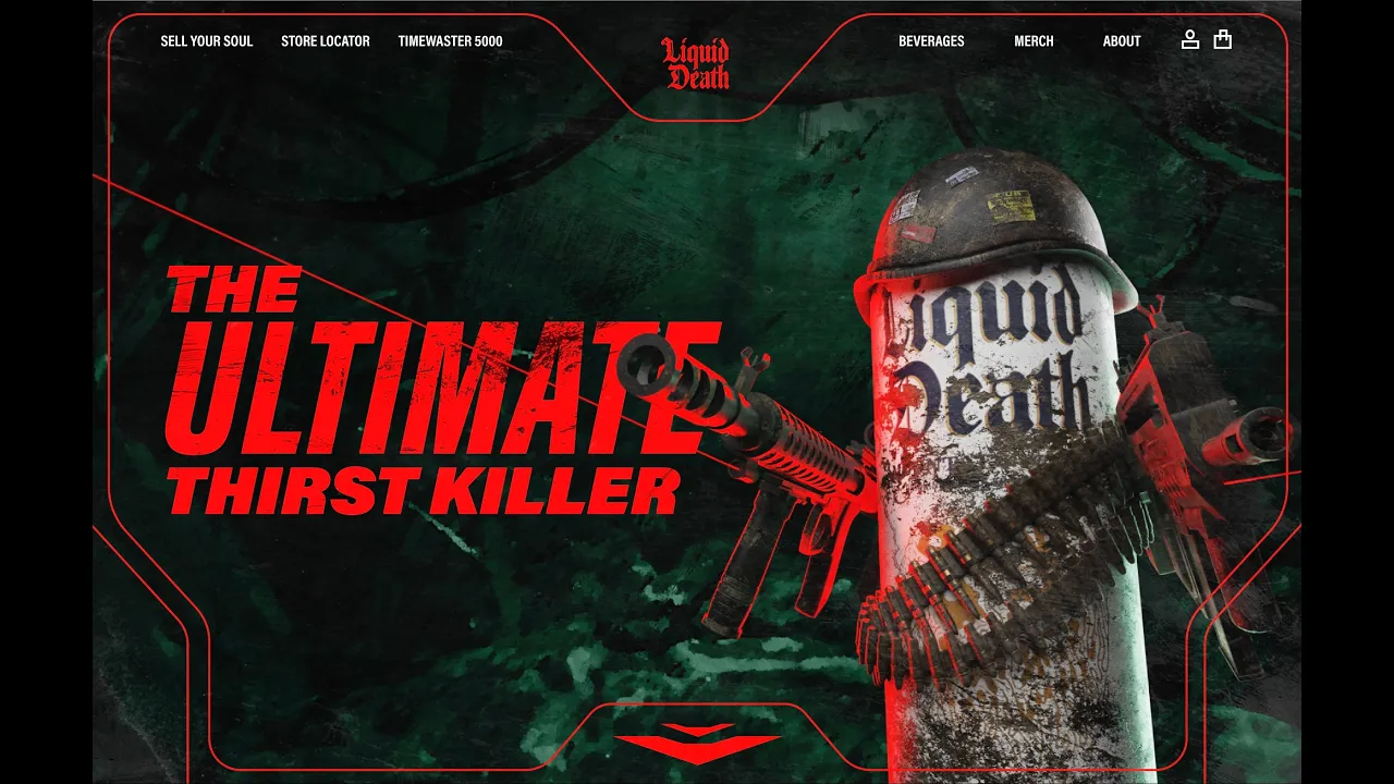
Liquid Death’s branding is absurd. Their lack of conformity and boldness to promote themselves in a way so different from their competition is what drew me to them in the first place. However, their website lacked the highly conceptual, eye-catching visuals they used for merchandise and marketing. Creating a website that better reflects the brand’s personality is important for connecting with target consumers. The concept for this website was ultimately drawn from the company’s tagline: murder your thirst. This begged the question, what would this thirst murderer look like? The concept draws heavy inspiration from movies like Rambo, Predator, and Commando, portraying a can of Liquid Death with weapons drawn, the ultimate thirst destroyer. The first three sections take advantage of animated scroll-controlled transitions to create a more interactive and dynamic experience. The website features a HUD, which helps guide users through the scroll animation of the first three sections and brings balance to the use of the color red on the site.


